About PunkRock Big Year, Blogging-strategy and ticking tomatoes
The Punk of Birding
Whenever the word Punk has to be mentioned on Birdingblogs, then that is a post for me. I have already done a post called the Punk-chicken, a post about the Punk Heron, Punkbirder lyrics and even a post when I went birding with the Punkbirder. It is not at all surprising that writing about Paul Riss and the Punk Rock Big Year challenge falls on me. While the project has already had some exposure in blogs of our colleagues Birdfreak and Birdchick, I feel that making yet another referral about Paul’s project would be a bit superfluous. I’d like to concentrate more on the blogging process that Paul has gone through in the first three months of Punk Rock Big Year’s existence. It is a very different blog today compared to when Paul started! This post is as much about the blogging process, as Punk Rock . How can a new blog grow during the ride? How will the blogger grow? What techniques and tricks are there to make a better blog – or at least a blog with more readers. In December I got a tweet from Paul answering a desperate blog post of mine screaming for a new logo for Birdingblogs. Paul is a designer – a very expensive designer for corporations – but willing to help fellow birders for a more modest sum. I immediately loved his project description for his own blog:
- To see as many birds as possible within Ontario in one year and in the process:
- Change the public stereotype what a birder looks like?
- Make a documentary film of the pursuit
- Show the younger generation that birds are cool – and punky.
- Highlight conservation concerns
- Get a new tattoo for each bird recorded through the year. Ouch!
Birdingblogs Logo
Hey, maybe we can swop some favors, eh? Nobody really liked the SUPERMAN B that I had created together with my programmer. I admit it myself – it was hideous! And Superman had threatened to sue us for plagiarism. If there is one thing you don’t want, it is a mad superheroe up your ass!
I wanted a logo that worked as well as favicon – the little icon next to the url – as well as a stand-alone logo. That was the reason for the B in the first place. I had an idea with a B in form of a bird, we also were considering a feather. Paul’s genius showed immediately. He produced a number of simple and effective suggestions. The Birdingblog members voted for different logos. There was no concensus, except that one of the 10 birdbloggers felt as I did. The red B with the bird. So I asked Paul, which one he preferred. His choice was the same as mine! After being in use for almost 3 months now, our new logo feels absolutely right. Have a look!
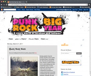
Before/After
Time for Payback
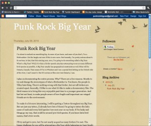
A new year entered and it was high time we fulfilled our part of the deal. I checked Paul’s first posts for the year. Hmmm! Was the nicest thing I could say. My thoughts were: This does not look right. He will never get any readers if it looks like this. Not only were there no pictures, but the text was too descriptive and too long making in frankly a boring read. Hmmm – but Paul is a designer, why does it look this way?  Click for full size.
I had to write Paul immediately and tell him to get his act together.
Hi Paul
I have started to write the introductory blogpost about your quest. Something like this.
“Here at Birdingblogs we like things with an edge. We’re not afraid of letting a foul mouthed blogger like Tom McKinney on our team – and lose all possibilities of getting any decent Google Page Rank (Google punish pages with profanities). We don’t shun to feature controversial or opinionated issues such as Wind power – or gay birders taking marital vows (OK, that post is still missing – but it will appear). And anyone who has done something bad for birds and need a kick in the nuts – we shall put on our Doc Martens – and stomp. Rest assured! Therefore it our pleasure to promote this rather odd quest in 2011. Paul Riss will do a big year in Ontario. Nothing strange about that – you’d think? Well how about blogging about a big year with Punk Rock music in the car to the twitch or in the bar the night before the twitch to the early hour…and then finishing the day at the Tatoo parlor – getting a new tatoo for every new bird on the Ontario year list. That is birding with an edge. That is Punkrock Big Year 2011. Be sure to check out Paul’s site in the link above.”
Now here is the problem: Your site! No pictures. I need a graphic picture to illustrate your blog:
Some birders with an attitude.
A punkrock birder – Orange Mohican hair with blue bins
A tattoed birder
Anything that catch your eye…. And Paul, seriously – as a graphic designer…isn’t there something missing on your blog?
What I learnt about blogging in my relatively short time is that pictures are essential. You can use a lot of great pics for free by checking Flickr.com for Creative Commons pics. And the pics with copyright – you can always ask the owners for use…for your non-profit project. So try to find a decent pic of the birds you go for. They don’t have to be your own! It will make the posts more eye-catching and people will come back to the site. In the fast media consuming world of today – nobody has time to check out web-pages with only text. It needs to be very graphic (unless you write like Tom McKinney- but even uses pictures now!) You know all this of course….. I want Exploited with bins… you know what I mean?

Fortunately, Paul did not tell me to Exploit Off but was receptive to the tips. Since then, it is not only the layout that has changed.
Paul has changed; the way he writes, the way he includes his family in the quest, and frankly, now it is a great read with a Metallica video here and a family video with the twins there and of course tattoos. One of the best recent post, that shows how good his writing has become, is called A Birdless Weekend featuring the kids at dance class, but how Paul hopes the twins will encounter birding the same Paul’s Dad introduced birding to him. It is a brilliant piece including Paul’s spark bird – and how he became this obsessed PunkRock Big Year birder. Read it! Paul just wrote me saying:
I defiantly see a big change when I look back at older posts. The design is an obvious change, but it’s the writing and content that really has evolved. I agree whole-heartedly that it was basically shit in the beginning. But I didn’t know what I was doing. I was just floundering around, trying to figure out how to do what I wanted. I learned mostly from other bloggers. Following them, reading their posts. By trade I’m an advertising writer. “say as much as you can in as few words as you can. sell, sell, sell.” But with this, I’m really trying to connect with people. Not sell them anything, just entertain them a bit. You know, keep them interested in what I’m doing. And the proof that it’s working is in the fact that I get lots of compliments and people seem to be paying attention. I even have birders inviting me to bird with them abroad (even one’s that aren’t from Peru) ;-). And local birders too. This weekend, I posted to Twitter that I’m birding a certain place in Toronto and people have actually asked if they can tag along…
How to become a successful blogger.
I could end here – this is long as it is. But there is something in Paul’s story as a beginner blogger that I want to hang on to.I just set up a blog for someone who is completely new to blogging – my daughter! Paul’s story and the one I am about to lay out below, show that some good planning on both content and form helps the blog to get readers. Two weeks ago, I convinced my daughter to start blogging. Not my Peruvian toddlers, who you may know, but my grown-up 29 year old Swedish daughter from my previous life. She studies to become an author. I found it a bit strange that a future writer did not have a blog. So I simply started one for her. I paid for a domain – BlivandeForfattare.com (Aspiring Author) – and registered a WordPress.com account and invited her as admin so she could start writing straight away. I surfed around the free skins to try to find a good magazine type theme, and soon found one that works very well – and looks nice. I like skins that have easily navigable excerpts of the blogposts (you know like BirdingBlogs) rather than full posts in an endless column . This is particularly useful for someone who shares useful content such as tips and tutorials. I put forward the following guidelines to my daughter.
- Photo: Every post should have a photo relevant to the main topic. Denise is also a very good painter and a creative artistic photographer – so she can show off some of her own original work this way. I also taught her to search for Creative Common pictures on Flickr, which are free to use, as long as one give credit and a link back to the photographer.
- Usefulness. Always ask yourself, is this of value to your readers. There are thousands of Writer-to-be blogs in Sweden – Try to be different. Try to be useful to others. There is very little point in showing off your own literary work in the beginning. Nobody will see it – nobody will share it. But if it is useful, when someone sees it, they will share.
- Connecting Social Media – actively. Twitter, Facebook, Flickr and You Tube are the main ones. Also, consider a Posterous-type blog where the main objective is to share useful stuff on your topic, on which you throw in excerpts of the best posts on your main blog.
This third part, she does not master yet, so I have started a Twitter account @skrivtips (writing-tips) and a Posterous blog (also with a purchased domain skrivtips.com) – and at the time being, I am Ghost-Writer on both! On the Posterous blog, I (WE) share writing tips, I (WE) come across, as well as excerpts from her main blog – to drive traffic there. On the twitter account I have started following some 150 other writers and writers to be, and naturally I share all Skrivtips and BlivandeForfattare posts on the Twitter account. Both Denise and I share on Facebook – although most my Facebook friends don’t read Swedish – maybe one or two will read using Google Translate (used in the links)
The whole idea why Denise should become active using these social media as tools, is to build a network that will be useful eventually for her career as a writer. She will become a darn good one taken into account what I see on her blog. The network is of course not only to promote your own stuff, but to be there for those that may need something you can offer. As seen with the example with Punk Rock Big Year, Paul got some tips to improve his blog – and a blogpost about his project – and we, Birdingblogs, got a fantastic logo.
On Denise last post she wrote about the Pomodoro technique. After months of writers cramp and slow progress, she had a writing session of over three hours effective writing using the Pomodoro technique. I used the same technique finishing this post.
Do you use any of these techniques? What is your blogging strategy? How have your writing developed since you started? How has the looks of your blog changed?


